
Buy Online Pickup In-Store
Context
In the fall of 2016, Famous Footwear began the implementation of their buy online, pickup in-store (BOPIS) initiative. Previously, the user could see their local inventory, but could not choose pick up as a delivery method. The business goal of the project was to lower company shipping costs. I was the lead UX designer on the project.
Results after 2 months
The projected amount saved doubled
BOPIS orders accounted for 20% of all orders placed.
In December 10-24th, BOPIS accounted for 40% of orders.
The program saved on shipping costs, but it also captured the sales of last-minute holiday shoppers.
Takeaways from a survey done 6 months post launch
About 2 in 3 customers reported using the in-store pickup option for the first time (65%), and the vast majority of customers say they plan to use it again in the future (95%).
Customers find it easy to input their stores (99%) and search for products available at their local store (70%).
Define
I learned BOPIS is meant to create an easier shopping experience, is supposed to help to the user make an informed decision, and is offering the customer a speedier option to receive their purchase. I learned BOPIS is not meant to replace in-store shopping and is not supposed to clutter the shopping funnel.

The problem
In the end we distilled our research into one problem to focus on:
How might we create a seamless experience for our customers online and in-store? How do we not disrupt their journey, but enhance it instead?
Measurements of success
We will measure success by money saved in company shipping costs and ease of use by customers.

A page from my design file that I delivered to developers. Each screen had annotations of design decisions and interactions for the developers to reference.
Design process
After performing extensive competitor research, I created user flows with the input of the developers. The flows outlined the end to end customer journey. This included when the customers arrives on the site through purchasing a product and the emails they receive post purchase. From there, I wireframed the user flows, presented to stakeholders, did the visual design on all screens, and handed over the design specs to the developers.

A page from my design file that I delivered to developers. Each screen had annotations of design decisions and interactions for the developers to reference.
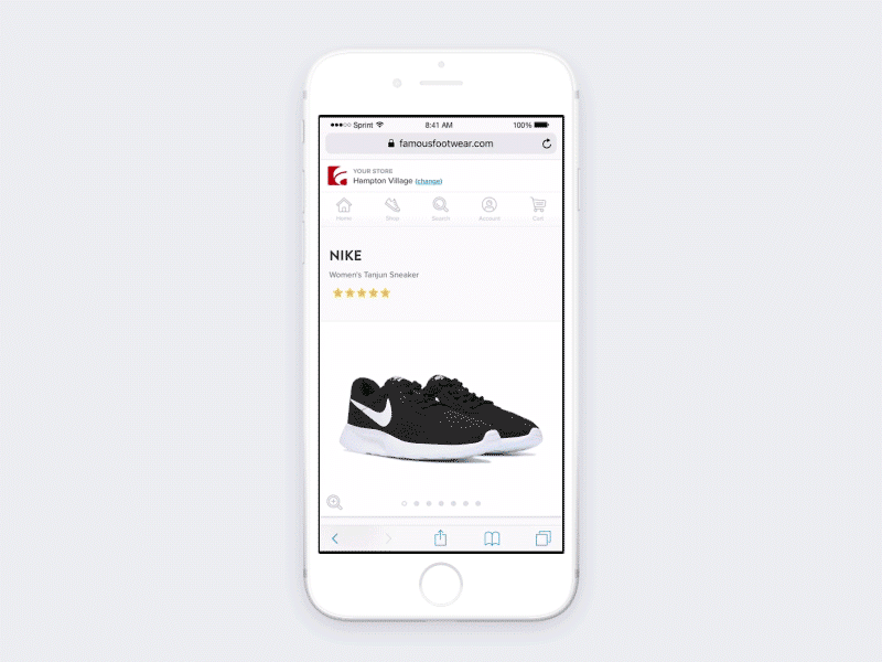
Feature 1: Header
From the homepage, the user has the option to set their store in order to see their pickup options.


Feature 2: Results Page
When the in-store toggle is on, a line with the user’s selected store is displayed. This visual cue gives customer’s clarity around which products are available in their preferred location.
Feature 3: Product Details Page
The user can set their store on the product details page or they can check the availability of the product at a different store using the Check Pickup Options modal. The modal was a net new feature that allows the user to all locations where they could buy that product within a 25 mile radius.


Feature 4: Cart Page
The user can also change their delivery methods or their store on the cart page.