Redesign
Context
The Via Spiga brand went through a redesign in 2017. As part of the redesign, it was time to update the site and make it responsive and aligned with the new brand aesthetic. I was in charge of the user experience of the new site.
Define
I conducted competitive research as well as talking with the brand team about their goals for the new site. Previously the site was on a black background making it non legible. I wanted to ensure the new site reflected the new sleek design of the shoes and, at the very least, be more legible.
The problem
I distilled the research down into one question,
How might we create an information architecture and new site design that is pleasing, intuitive to the user, and aligned with the brand aesthetic?
Design Process
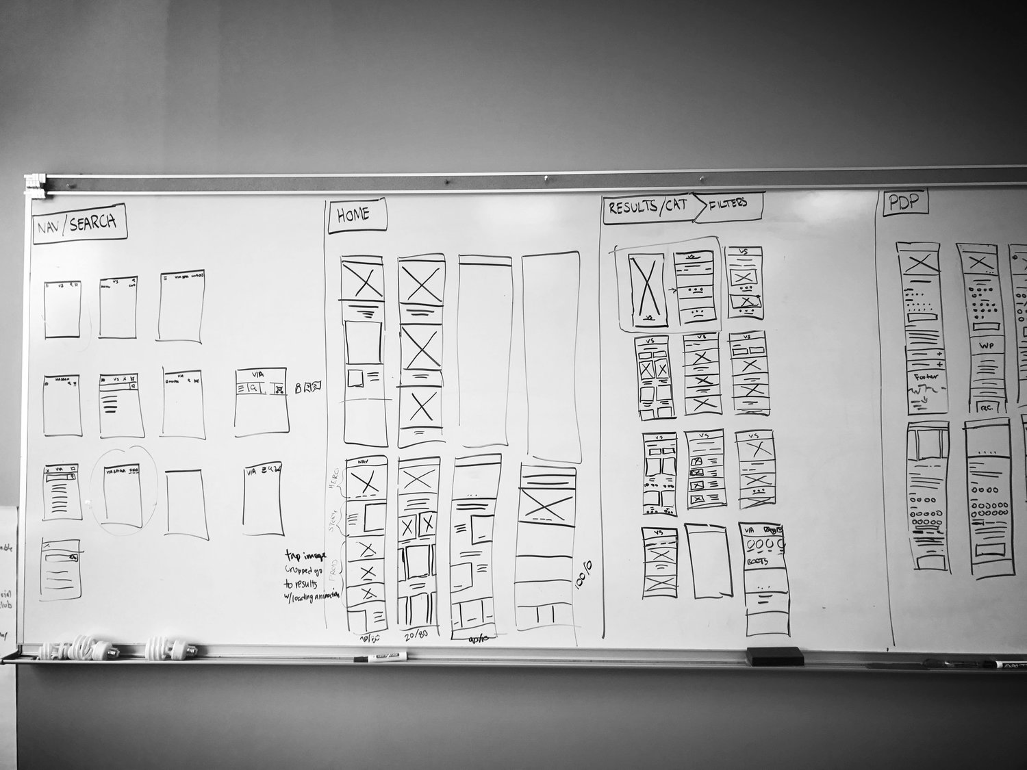
I created user personas based on our data of who our current customer was and who we were targeting with the redesign. Based on the personas, I conducted competitive research and moved to the whiteboard to start wire-framing. Based on the feedback from the team, I moved into Sketch to quickly prototype my designs for the navigation, results page, and the product details page.
Feature 1: Clear Information architecture
The former IA was confusing and I wanted a streamlined experience for our user. The brand team wanted to created some content story pages as well. They needed to be accounted for in the new site IA and design.
Feature 2: Simple Navigation
The former site was not responsive. I needed to create a scalable navigation across mobile, tablet, and desktop.
Feature 3: Clear Shopping experience
The shopping experience must be simple and clear. Previously, it was hard to read the results and product details pages. I wanted to draw attention to the product, but have all the information needed be readily available to aid in the purchaser’s decision.


